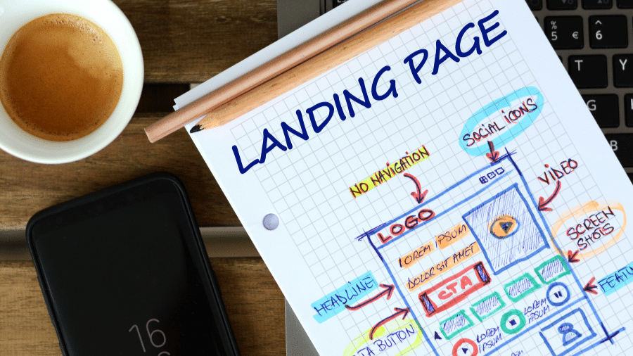
Landing pages hold a special place in the hearts of marketers and businesses alike. A well-crafted landing page can be a powerful tool to drive conversions, capture leads, and boost revenue. But what makes a landing page truly effective? How do you design a landing page that converts visitors into customers?
In this article, we will dissect the anatomy of a high-converting landing page and explore the key elements that contribute to its success.
-
Headline and Subheadline: The First Impression
-
- The headline is the first thing visitors see when they land on your page. It should be attention-grabbing, clear, and relevant to the ad or link that brought them there. The subheadline, positioned just below the main headline, provides additional context and reinforces the value proposition.
- A strong headline communicates the primary benefit or solution your product or service offers. It should evoke curiosity and compel visitors to read on. Avoid using jargon or complicated language; simplicity is key. Remember, you have only a few seconds to make a lasting impression.
-
Hero Image or Video: Visual Appeal
-
- A compelling hero image or video is essential to engage visitors quickly. Humans are visual creatures, and a relevant and eye-catching visual can communicate your message more effectively than text alone. Use images or videos that showcase your product or service in action or evoke the emotions you want your audience to feel.
- Videos, in particular, can be incredibly powerful. They can tell a story, explain complex concepts, and build an emotional connection with the viewer. Make sure the visuals are high-quality and optimized for different devices and screen sizes.
-
Unique Selling Proposition (USP): Stand Out from the Crowd
-
- Your Unique Selling Proposition (USP) is what sets your offering apart from competitors. Clearly communicate why your product or service is different and why it’s the best choice for your target audience. Highlight the value and benefits visitors will receive by choosing your solution.
- Use concise and persuasive language to convey your USP. Bullet points or short paragraphs work well to capture attention and make the information easily scannable.
-
Call-to-Action (CTA): The Key to Conversions
-
- The call-to-action (CTA) is the most crucial element of your landing page. It’s the instruction you give to visitors, telling them what action to take next. Whether it’s “Buy Now,” “Sign Up,” “Download the Ebook,” or any other desired action, the CTA should be prominent, compelling, and easy to find.
- Use contrasting colors to make the CTA button stand out from the rest of the page. Choose action-oriented words that create a sense of urgency or excitement. Test different CTA texts and button designs to see what works best for your audience.
-
Social Proof: Trust Builders
-
- Building trust is vital for conversions. Include social proof elements like customer testimonials, reviews, case studies, or user-generated content to showcase the positive experiences of previous customers. Testimonials with names, photos, and affiliations have higher credibility.
- Additionally, display any badges, certifications, or awards your business has received. Trust seals, such as SSL certificates, can also increase visitor confidence in providing personal information.
-
Benefits and Features: The Value Proposition
-
- Clearly outline the benefits and features of your product or service. Describe how it solves the visitors’ pain points and fulfills their needs. Use bullet points or short paragraphs to present the information in a scannable format.
- The benefits should focus on the end result customers can achieve by using your offering, while the features provide details about how it works. Strike a balance between appealing to emotions and providing logical reasons for making a decision.
-
Visual Hierarchy and White Space: Aesthetic Appeal
-
- A well-designed landing page follows a logical visual hierarchy, leading the visitors’ eyes from the headline to the CTA. Use larger fonts, bold colors, and varying font sizes to guide the viewer’s attention. Organize the content in a way that flows naturally.
- White space, or negative space, is crucial for the overall aesthetic appeal and readability of the page. It gives the elements room to breathe, making the content more inviting and easier to consume.
-
Mobile Responsiveness: Reach All Devices
-
- In the age of smartphones and tablets, mobile responsiveness is non-negotiable. Your landing page must look and function flawlessly on various devices and screen sizes. Mobile users make up a significant portion of internet traffic, and neglecting them can cost you valuable conversions.
- Test your landing page on different devices to ensure a seamless experience for all users, regardless of how they access your site.
-
A/B Testing: Continual Improvement
-
- Even if you create what seems like the perfect landing page, there’s always room for improvement. A/B testing allows you to compare different versions of your landing page to see which one performs better.
- Test various elements such as headlines, CTAs, images, and overall layouts. Small changes can have a significant impact on conversion rates.
Crafting a high-converting landing page is an art and a science. It requires a deep understanding of your audience, their pain points, and their desires. By combining compelling copy, eye-catching visuals, trust-building elements, and strong CTAs, you can create a landing page that turns visitors into customers.
Remember to keep testing and optimizing your page to stay ahead in the competitive digital landscape. A well-designed and effective landing page can be a game-changer for your business, leading to increased conversions and overall success.
Contact us and to help you boost your high-converting landing page and see your business soar to new heights!


